The Dig
Brand Strategy, Logo Design, Brand Identity, Packaging Design
-
Replenishing Our Environment Through Permaculture Farm
Based in El Nido (Philippines) The Dig is a participatory regenerative farm providing organically grown, nutrient-Filled food, clean air to breathe, clean harvested water to drink, and an educational space for engagement.
The Dig represents expression of how they interact with the environment we fInd ourselves in, our space, our shared network, and its common enterprises. As a social enterprise, it seeks to create a farm network with other neighboring properties to support the regenerative enterprises of each individual farm business.
-
The Mission & Challenges
Our challenge as a branding agency was to incorporate their regenerative enterprise’s design, movement, and practice. We created a theme that reflected The Dig’s work with nature, a deep contrast in the food production systems most of us unawarely participate in. We thought about The Dig’s respectful interaction with the land and accessibility to their target market of locals seeking affordable, healthy products without the pretentiousness of packaging and presentation.

• The Output & Impact
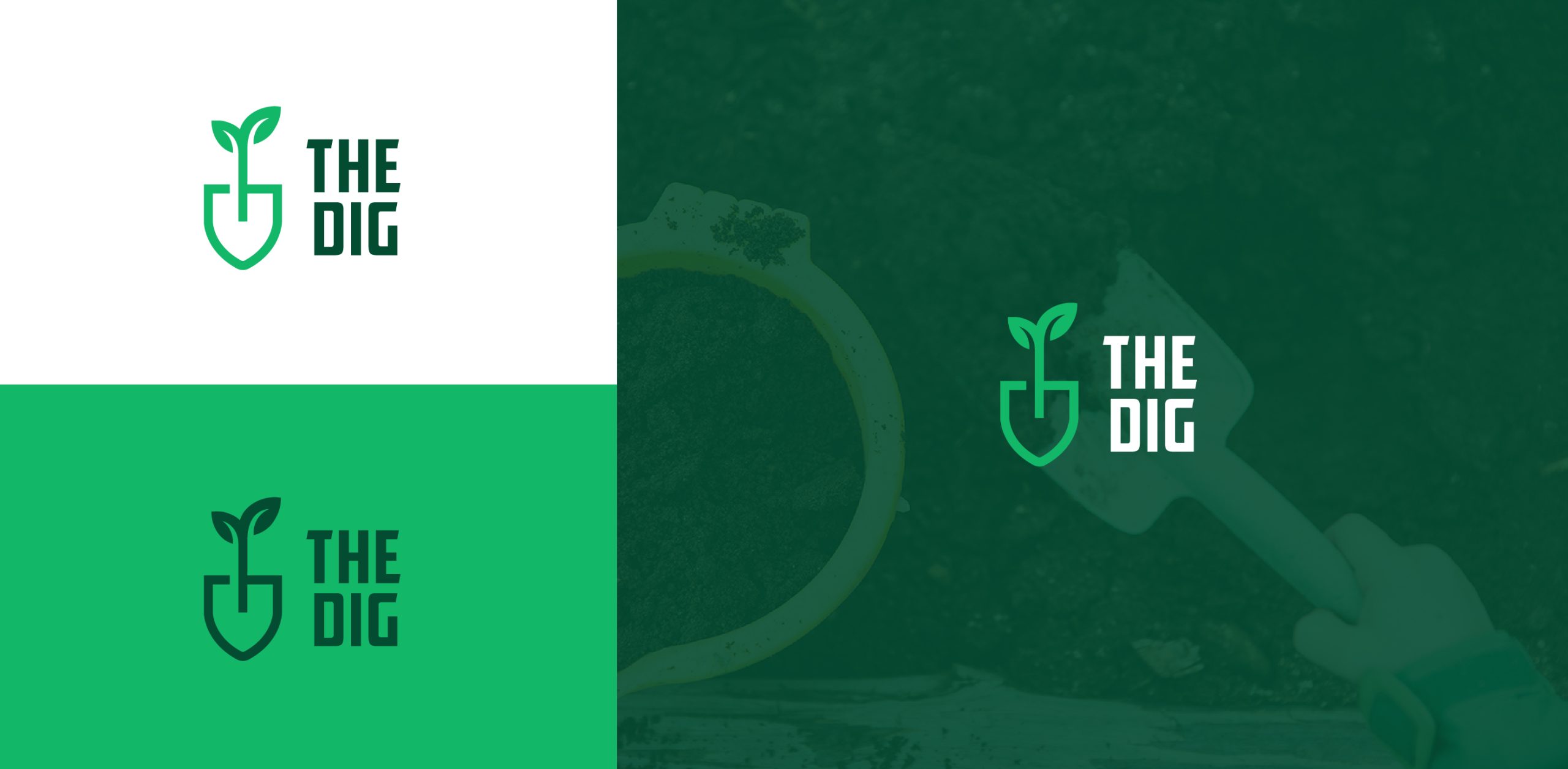
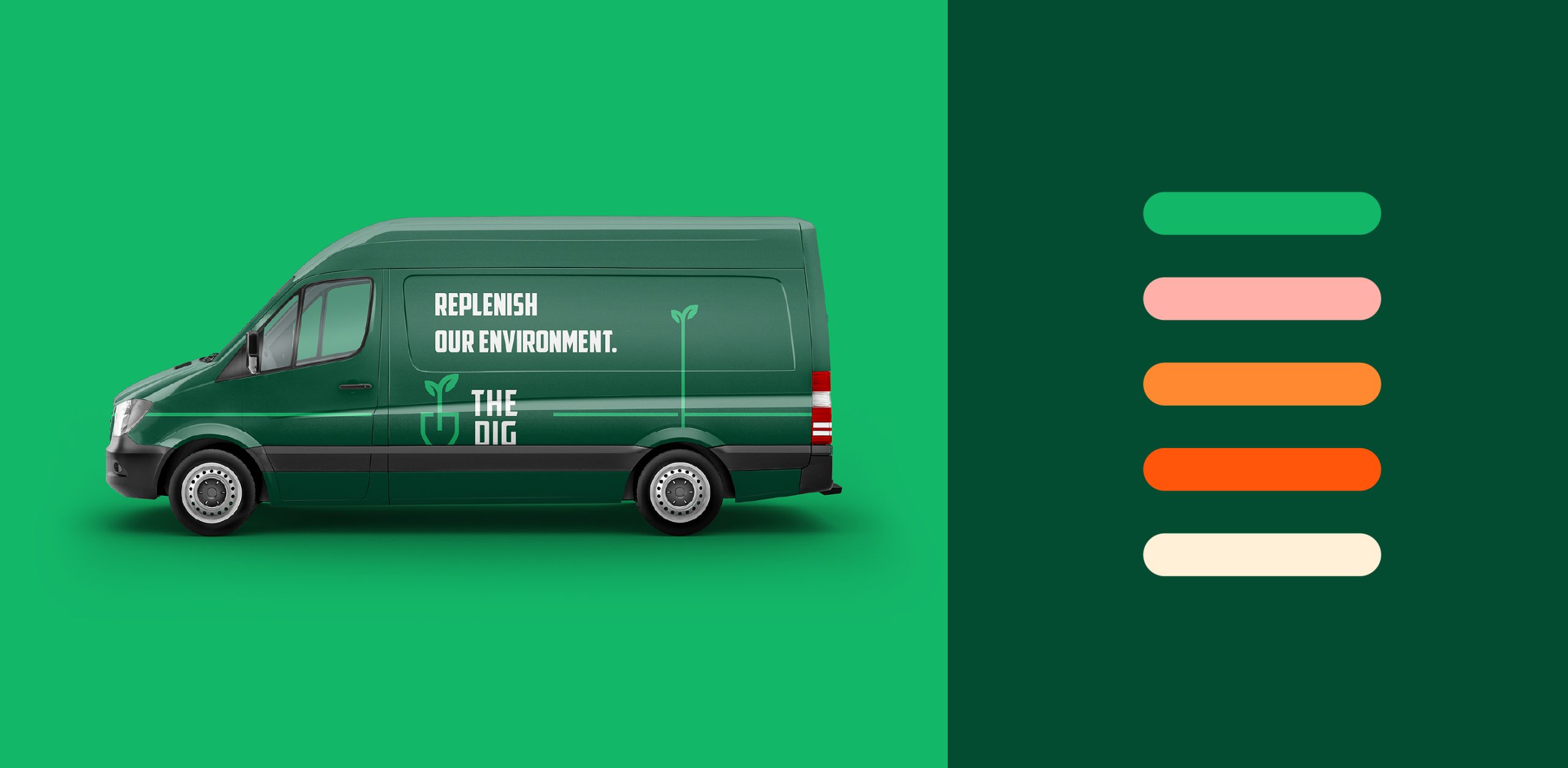
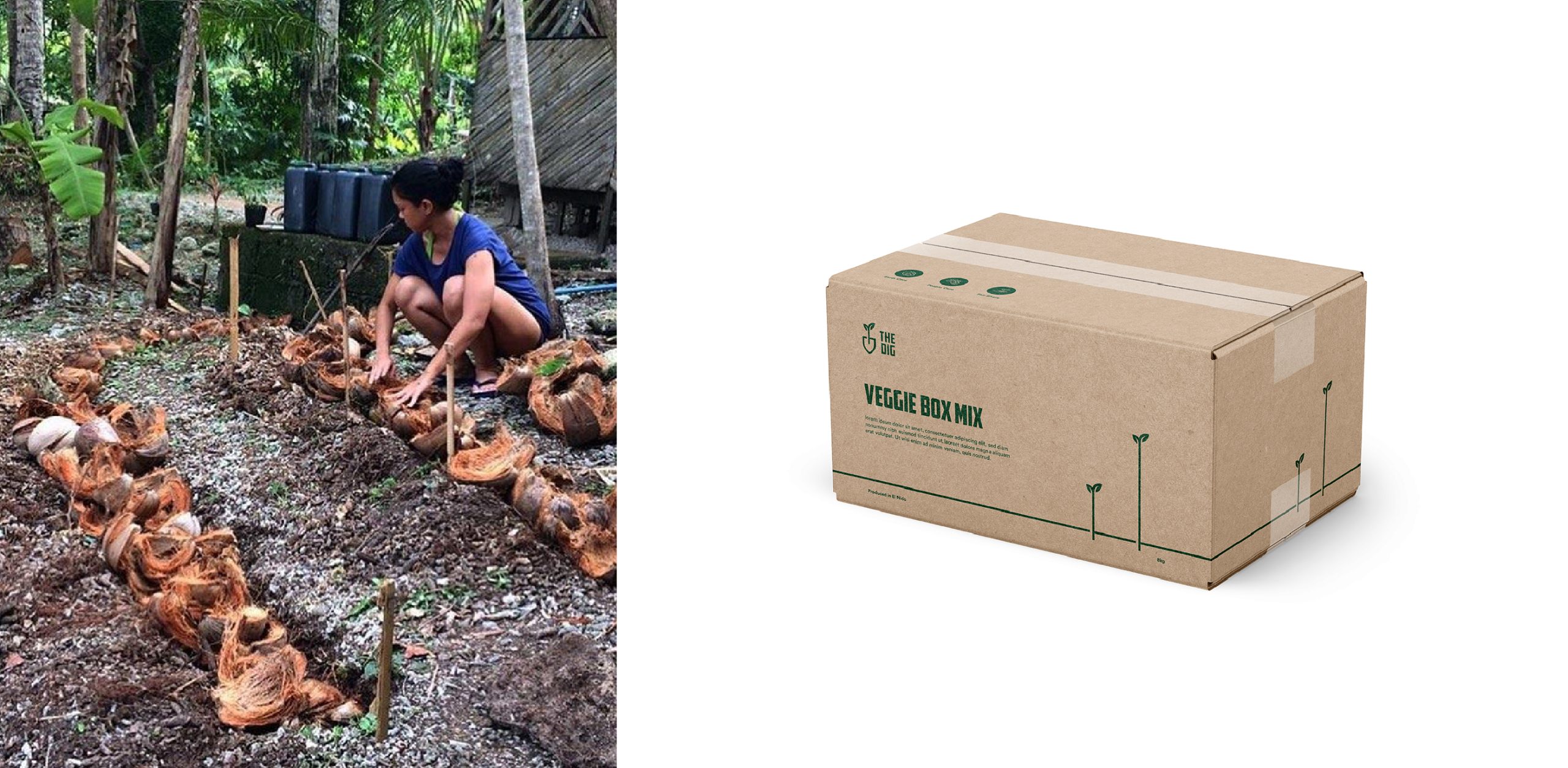
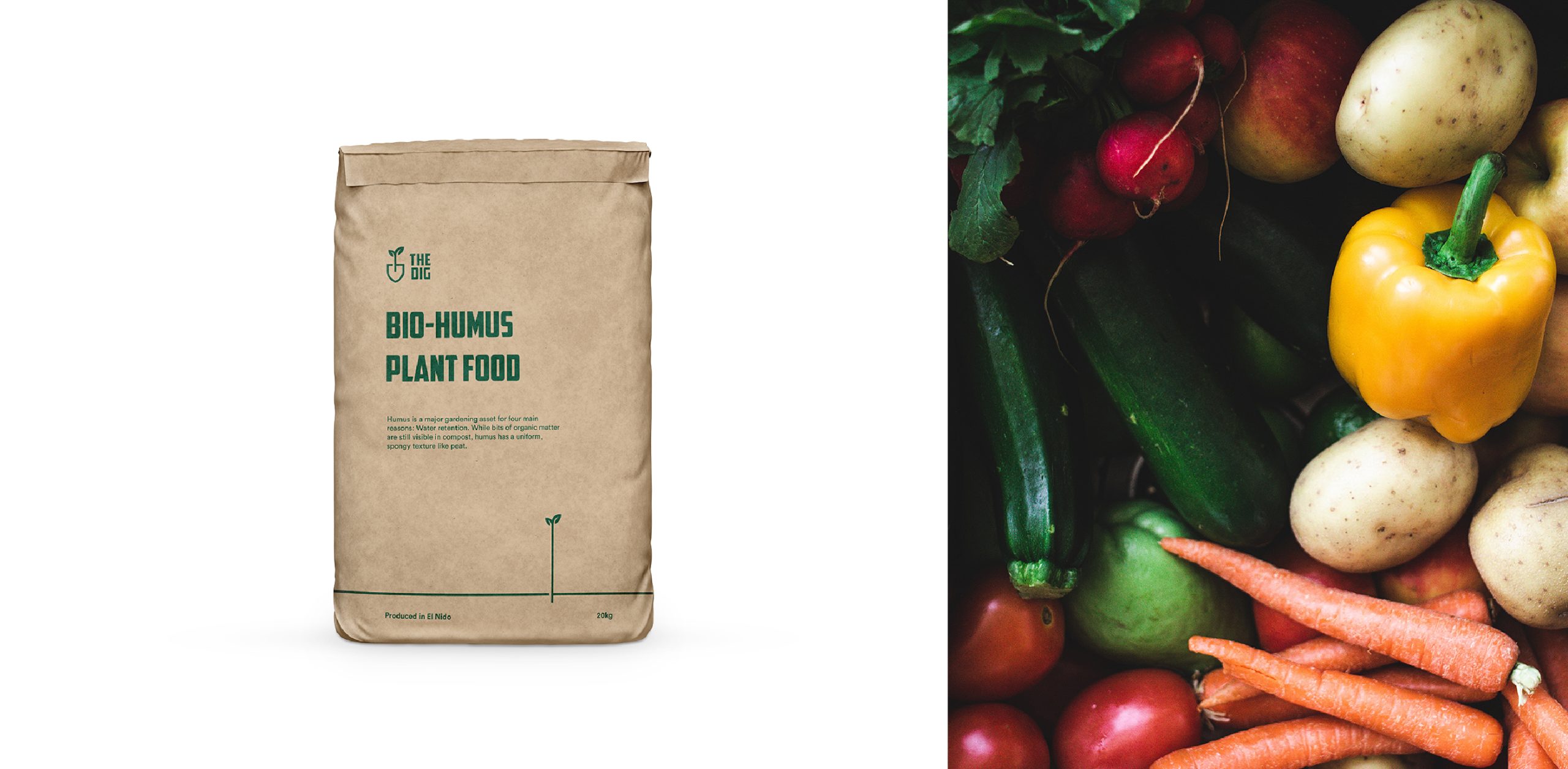
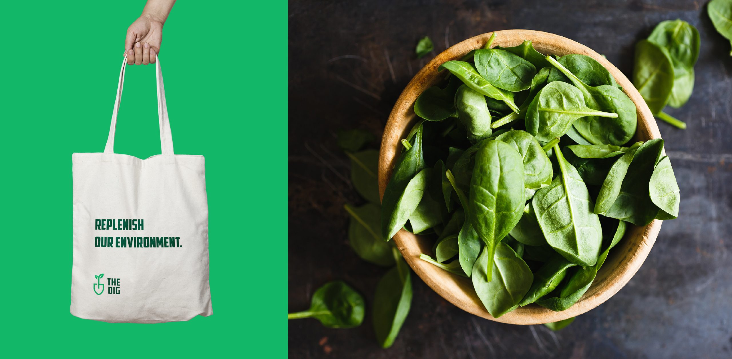
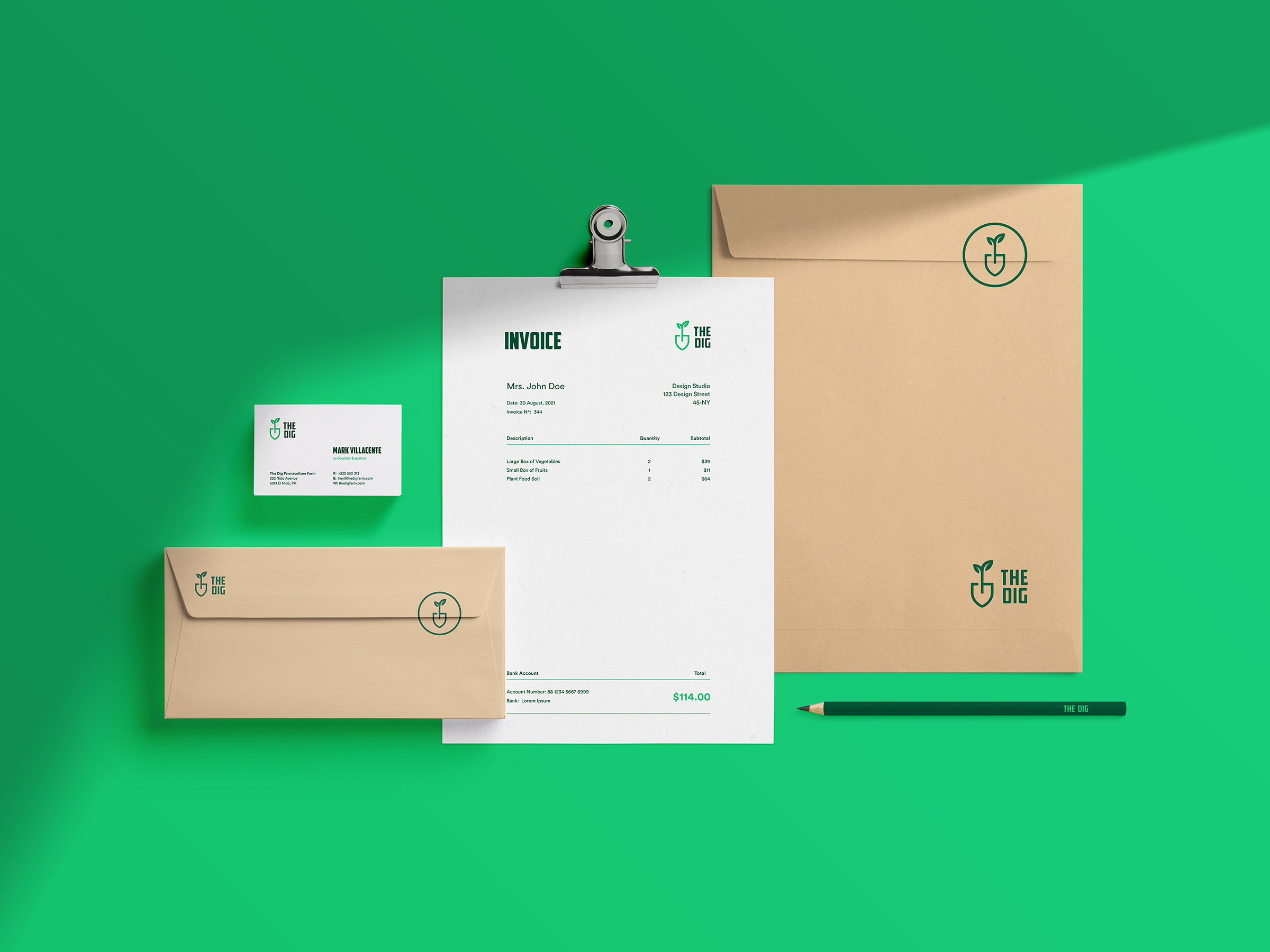
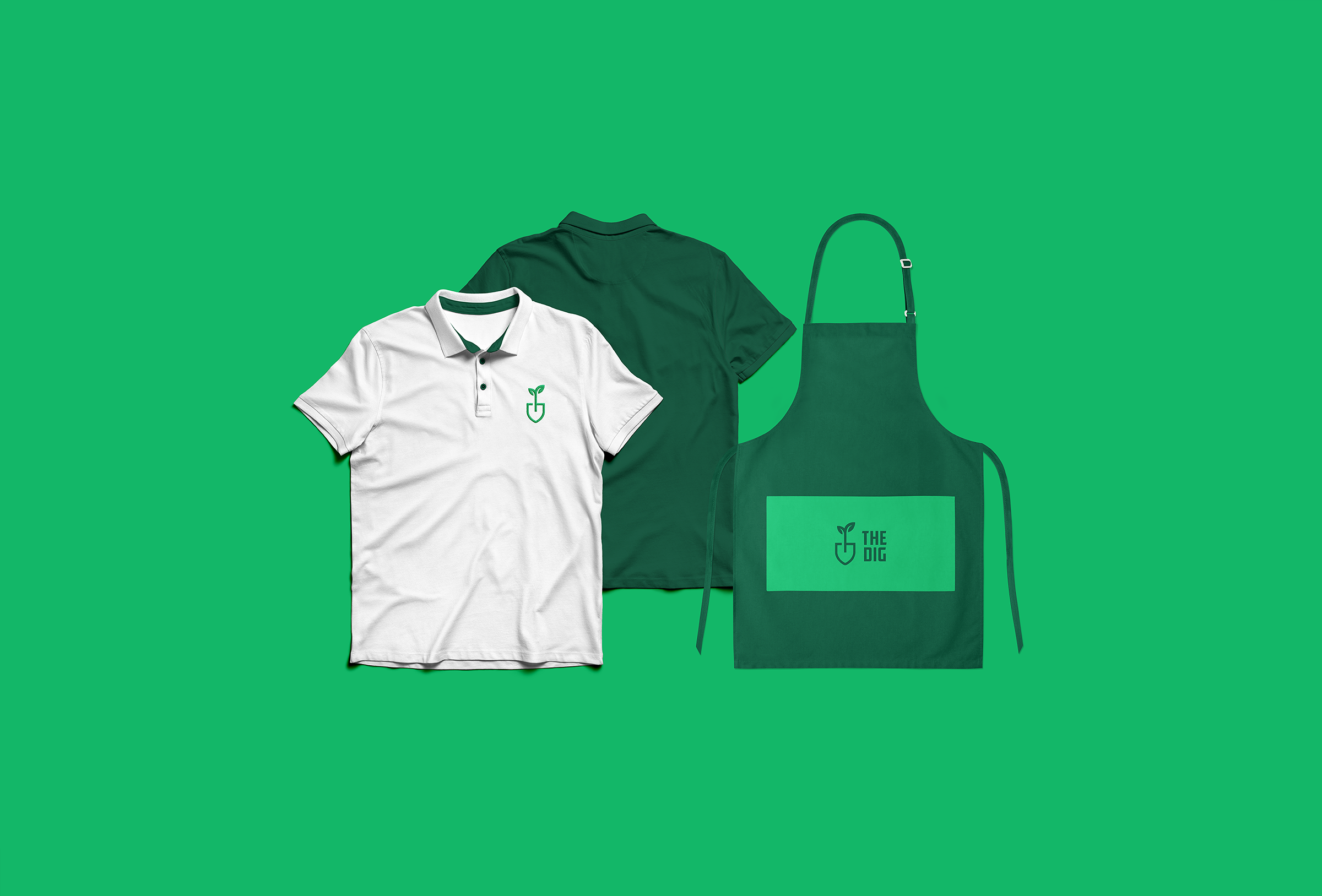
We crafted The Dig’s identity, which displays a thoughtful and rooted brand that conveys natural heritage and its core values. A new logo is made from the initials T and D, crafted as a shovel, which symbolizes farmer’s labor with care and love. That has been paired with the bold typography which works great both as a wordmark and for highlights on their packaging, made from recyclable materials. We are currently working on their e commerce and educational blog website which offers their full range of products, workshops, consultation services, and events.
The Dig expanded their farm network and are building a group of investors to further their goals of long-term education and regeneration. Since launch, even during the Covid19 pandemic, they are gaining more and more visitors and interest, and with a new website they will hopefully fully sparkle throughout 2022.
• Owner’s Words
We appreciate the visual translation of our vision, purpose, and drive at The Dig. Going through the different sets of visual elements we believe the fainal design theme sent a powerful message on the impact of regenerative enterprises intriguing many others to be involved. While we believe we’ve set ourselves apart in pioneering our ideals on the island, we have also benefeted from the creative inputs from Ivan and his team at Revoterra. They created an enjoyable atmosphere and proper feedback loop throughout the design process. Thank you from all of us at The Dig!
Mark Villacente, Co-Founder / The Dig
Thank You For Watching!
If you are interested in how we can help you grow, drop us an email and we’ll get to you as soon as possible.
Support Us on Socials
Behance
Dribbble
Medium
For any inquiries, reach out
anytime at hey@revoterra.com
