Nesting Table
Brand Strategy, Logo Design, Brand Identity, Packaging Design
-
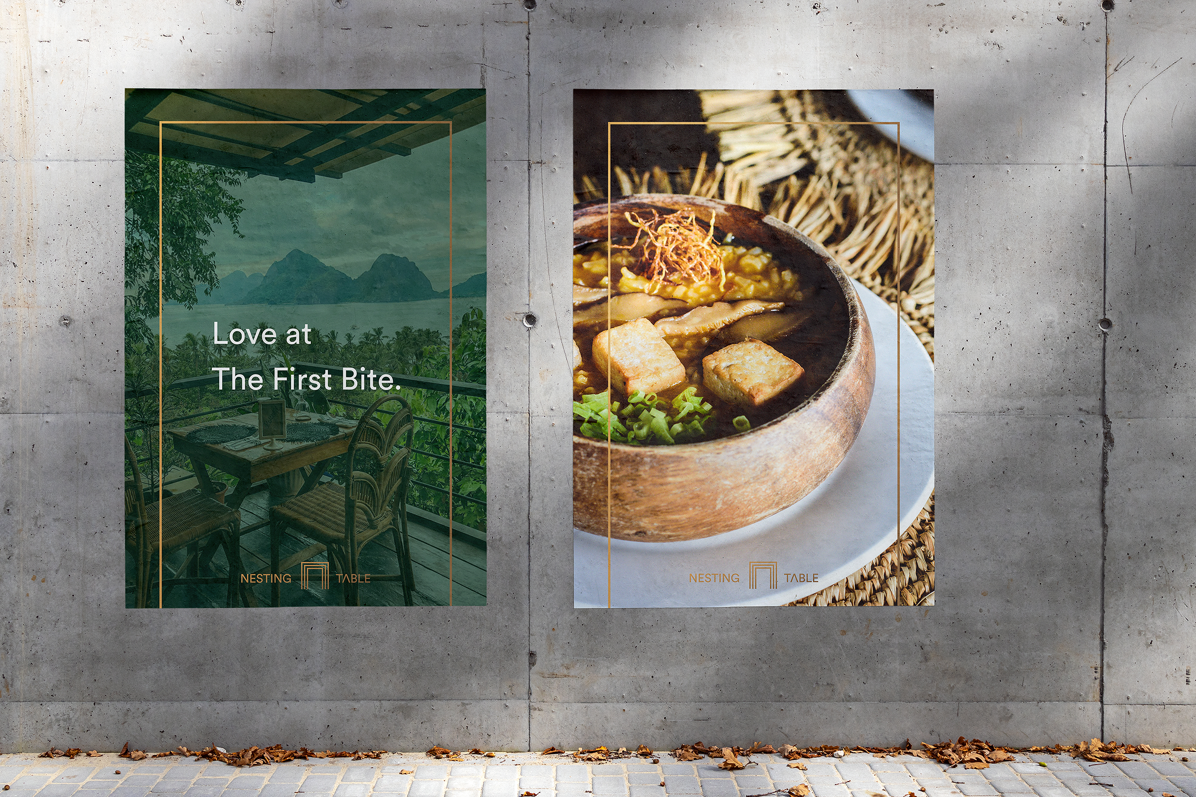
Love at The First Bite
Nesting Table is a farm-to-table restaurant based in El Nido (Philippines) that brings transparency to your next meal and allows you to be consciously part of the process, not simply a food consumer.
Farm-to-table restaurant is a move towards a more sustainable, localized economy that considers waste, food quality, accessibility, carbon footprint, affordability, culinary heritage, and regeneration. As a social enterprise, they support food gardens and small organic farms. In the hospitality sector, they provide a healthy, seasonal, local dishes with the highest quality ingredients free of industrial inputs and full of love.
-
The Mission & Challenges
Both the economic livelihood (tourism) and the island’s food security were reliant on outside inputs in the form of imported produce and tourists. Nesting Table decided to change that, taking the wheel in their own hands. Also, by partnering up with a network of farms, Nesting Table was able to expand its offerings for its seasonal menu. In response, one aspect of the project was to create a menu design that allowed them to be versatile in showcasing each food item. Our challenge was to portrait a brand that is so caring, simple and organic, yet so hiqh quality in terms of their food, approach and philosophy.

Local
Organic
Seasonal
Passionate


Our Philosophy
Farm-to-table restaurant is a move towards a more sustainable, localized economy that considers waste, food quality, accessibility, carbon footprint, affordability, culinary heritage, and regeneration. We support food gardens and small organic farms.
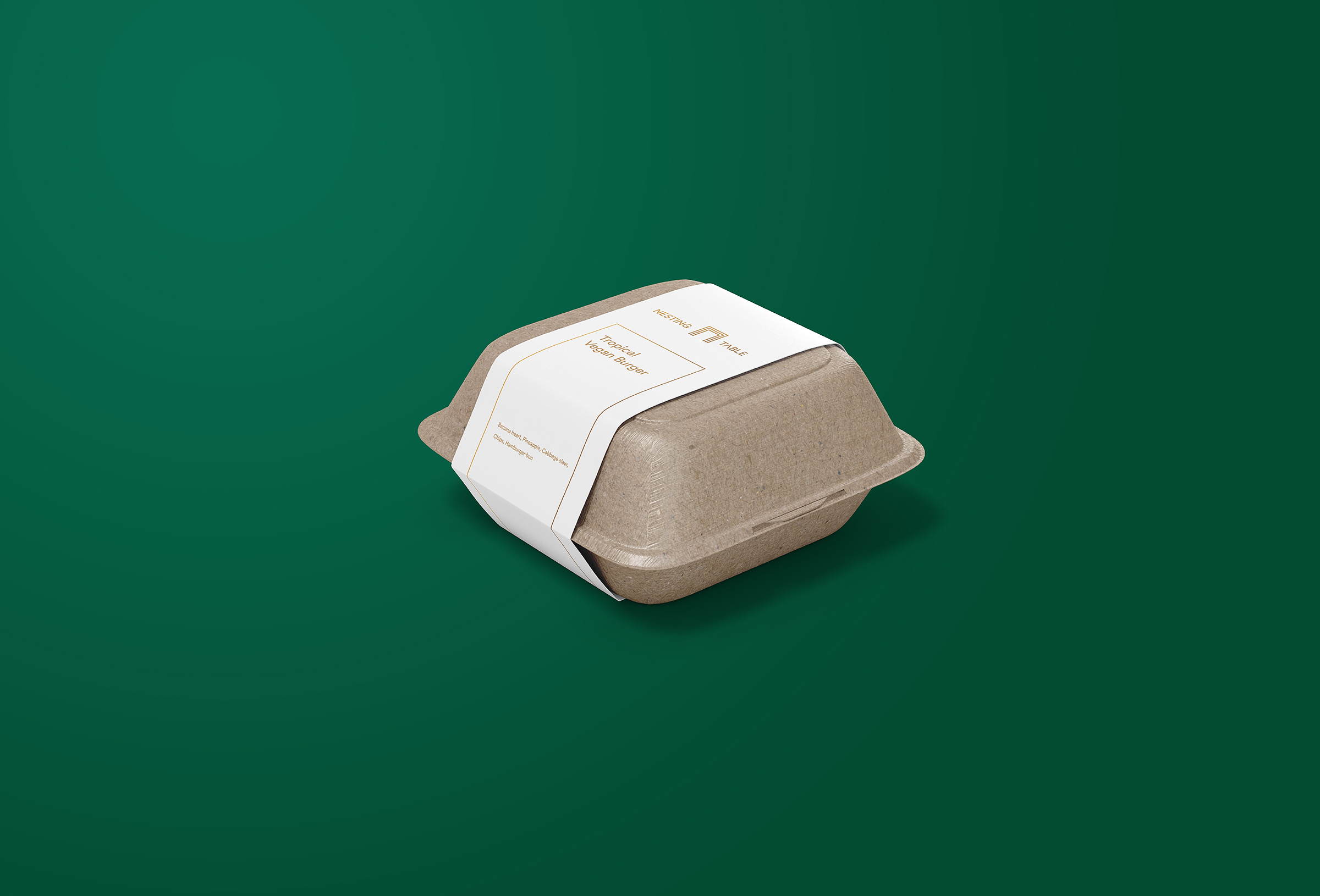
• The Output & Impact
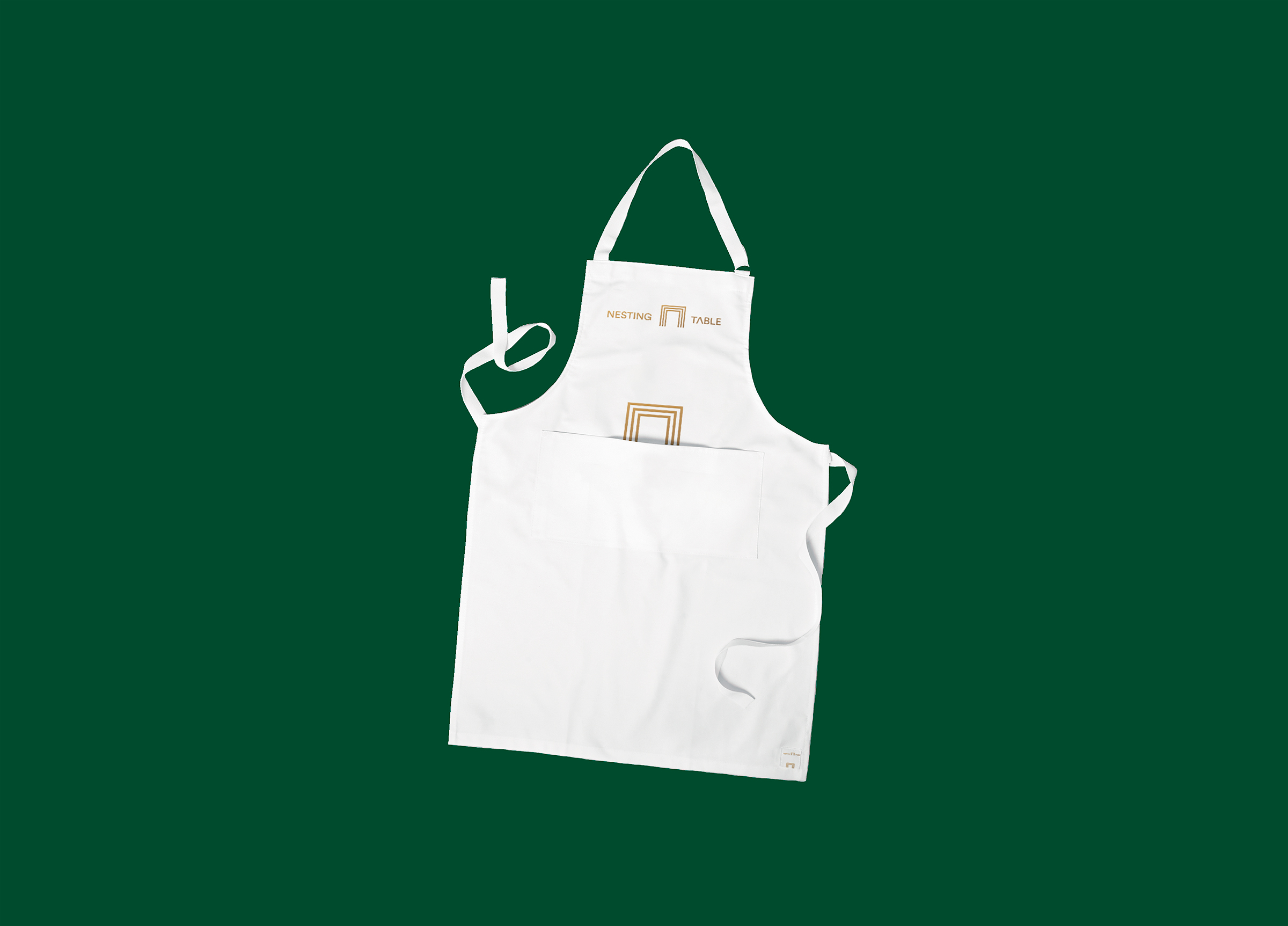
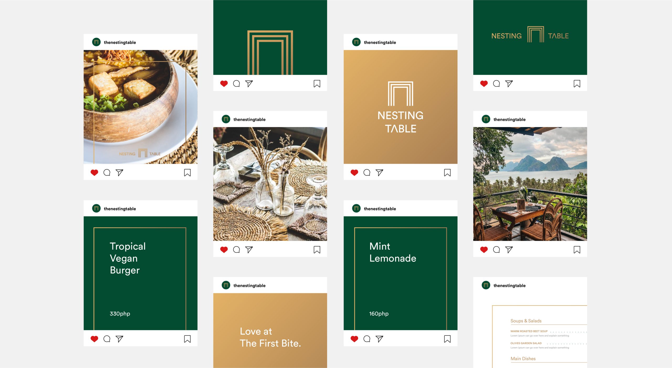
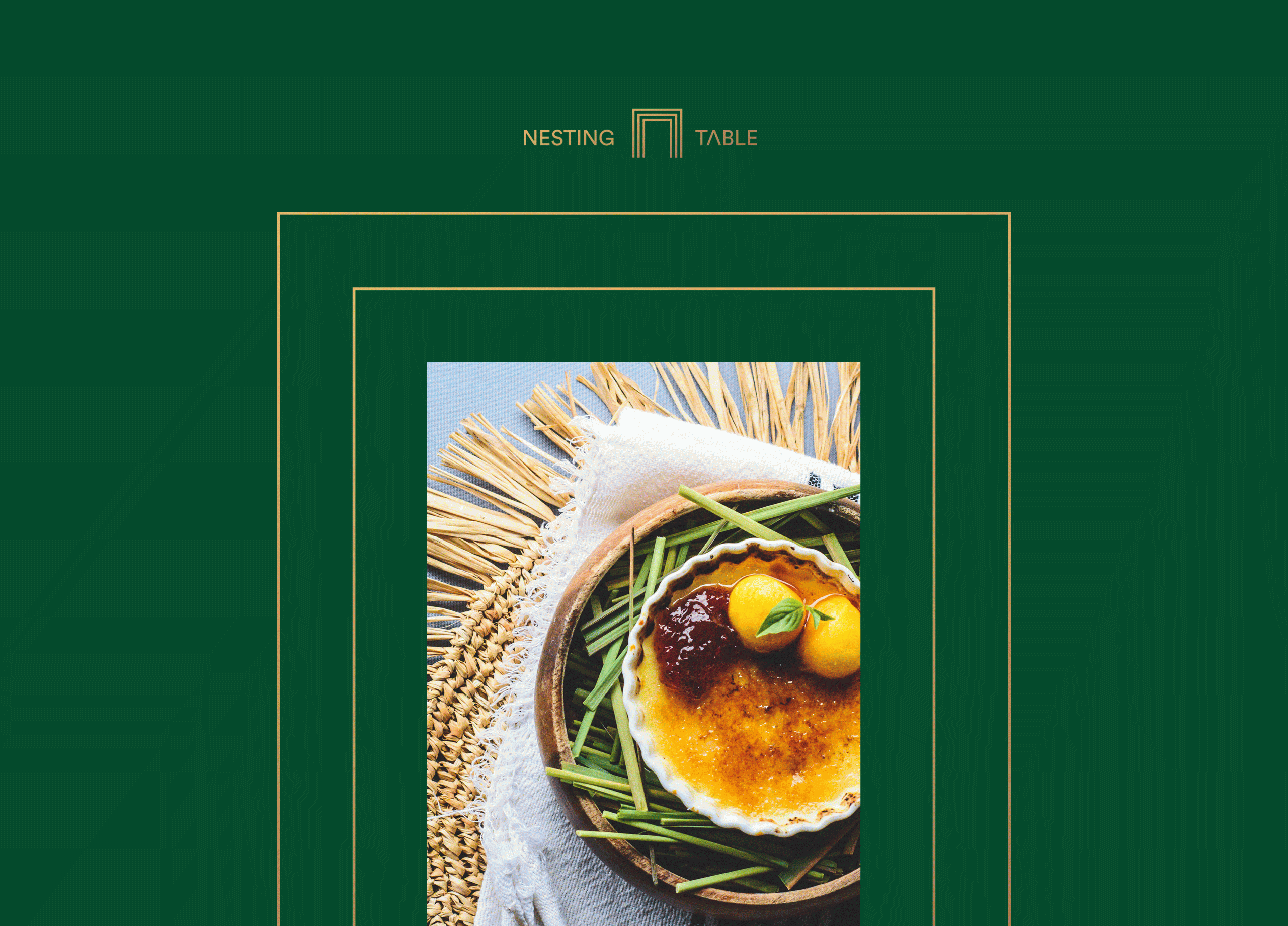
We opted for a natural color scheme, consisted of dark lush green – inspired by the greenery around the restaurant, and wooden/golden gradient which resembles natural materials used for their restaurant and interior. We combined that with the clean sans-serif typography to convey the intimacy and passion of those that prepared the meal. Throughout the branding journey, we used logo shape (nesting table) as a frame to highlight certain images and messaging.
The feedback we’ve received is that engagement has increased on their social media outlets as they were able to better visually articulate the stories of Nesting Table people behind the scenes.
• Owner’s Words
We wanted to update our logo and visuals, so that it can help us to establish a consistent brand identity. After hearing from our associates from The Dig, we reached out to Revoterra so they can help us as well. Can’t believe how everything was so easy and smooth to work with them. Ivan always made sure that our voice and opinion was heard and we ended up with an amazing identity, just the right amount of update and professional ideas that we needed. Finally we have an adequate menu design we can use and change throughout seasons + we are expanding more and more on socials with the new graphics they made for us. Super excited for having new visitors once again now!!
Clara Hailie Duarte, Owner / Nesting Table

Thank You For Watching!
If you are interested in how we can help you grow, drop us an email and we’ll get to you as soon as possible.
Support Us on Socials
Behance
Dribbble
Medium
For any inquiries, reach out
anytime at hey@revoterra.com
